Your business is all ready to take off. You are looking for a professional designer to find the perfect logo to represent your brand by translating the brand values correctly.
The logo will help create a positive association with the target audience, just like a compelling visual cue.
Here a question arises, what type of logo will work the best for you?
A million decisions set the basis of finding the right logo for any business, including layout, color, images, palette, etc. Usually, there are three main categories of the logo: word, image, and combination.
Here you will read about 9 different types of logos that are frequently used.
Quick Jumps
1. Brand Mark
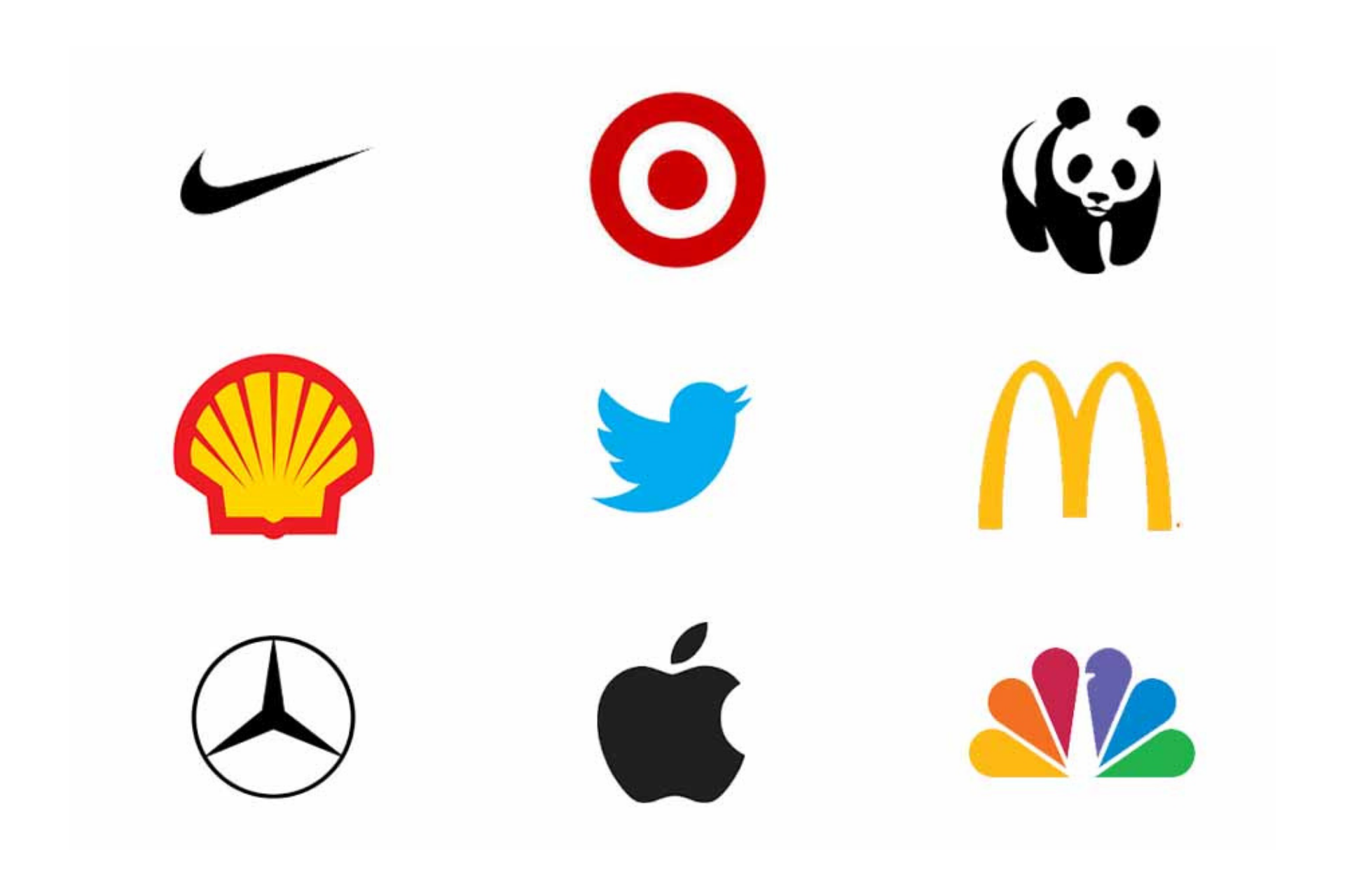 Pictorial marks or brand marks are the logos that consist of a graphic icon or symbol representing a real-world object. This is quite straightforward and simple, just like the outline of a coffee mug or a tree.
Read Also: 5 Of the Best Logos Ever in 2021
The object is used to tell a story or represent the brand’s unique values to the customers. These are easy to remember and clean-cut, and an image representing the service will send a quick message to the audience.
2. Mascots
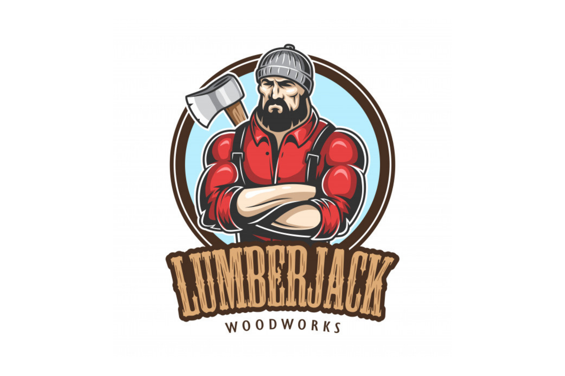 The images of the person or the character that act as a visual representation of the company are arguably the most family-friendly logotype. Mascots act like the spokesperson of a brand, and much of the advertising is centered around them.
The audience should get a fuzzy and warm feeling, which will create a memorable brand in the audience’s consciousness. Kids are more appealing to the tangible, physical characters they can relate to and will bag the parents to eat there.
3. Letterforms
 They are considered as the minimalist cousins of the monograms and are just one-letter logos. Since it would be difficult for a letter to create a brand identity alone, it should be bold and attractive.
Letterforms are scalable, and you can stick them anywhere. A successfully designed letterform will invoke the name of the brand in the minds of the audience.
You might be interested: 10 Principles Of An Effective Logo Design.
As these logos are just one letter, if these won’t be alluring and captivating, they would be pointless. The funky font, interesting color scheme, and dramatic backdrop can make the letter pop off and resonate.
4. Letter Mark
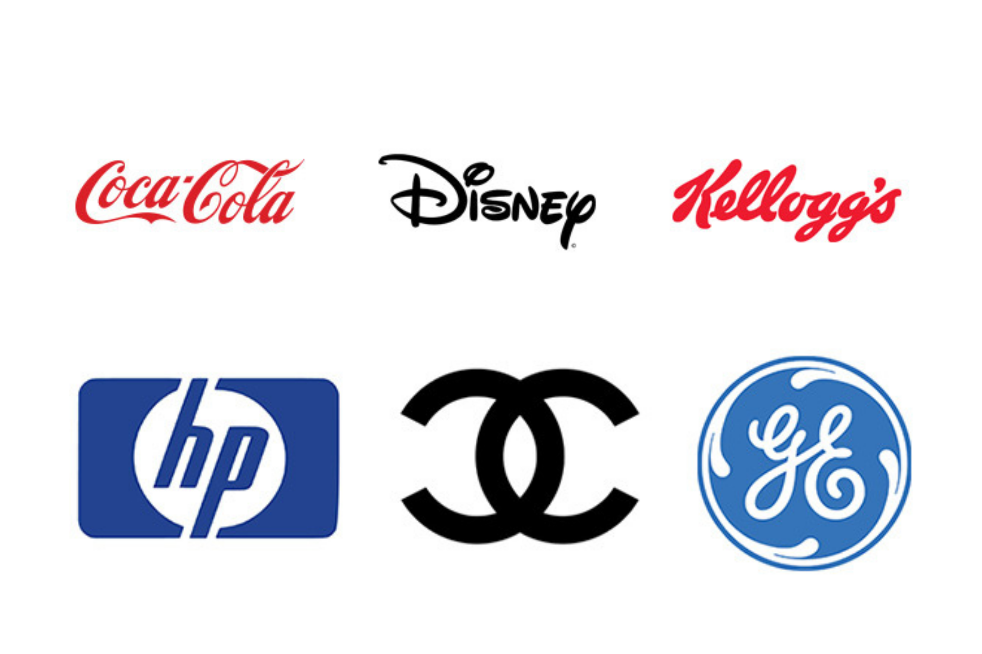
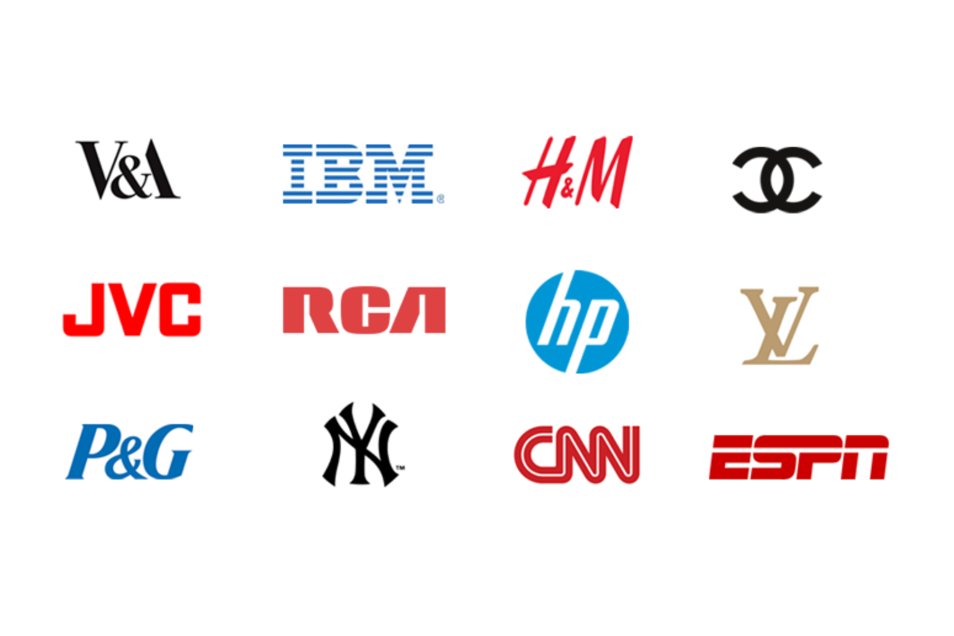 Monograms consist of brand initials like IBM, HP, HBO. These are the initialism of the few renowned businesses with lengthy names. They have turned to use the initials for brand identification with only 2 or 3 words to make the audience’s perfect sense.
Monograms are typography-based logos consisting of a few initial letters of the name of the company. It’s all about simplicity. For the businesses having a long name, letter marks work perfect and simplify the designs.
5. Emblem Logos
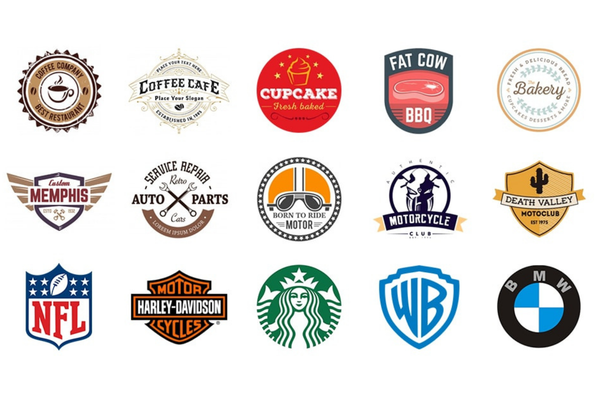 Emblems have stood intact in the test of the time, from royal stamps of the monarchs to the family crests. These logos include a typeface that quietly sits within the border.
Emblems lend an air of professionalism and are memorable. These work great to convey the brand message by casting an impression that the company isn’t going anywhere and will be there forever.
As these designs tend to have a detailed design, it is crucial to think about the scalability while designing them.
6. Dynamic Marks
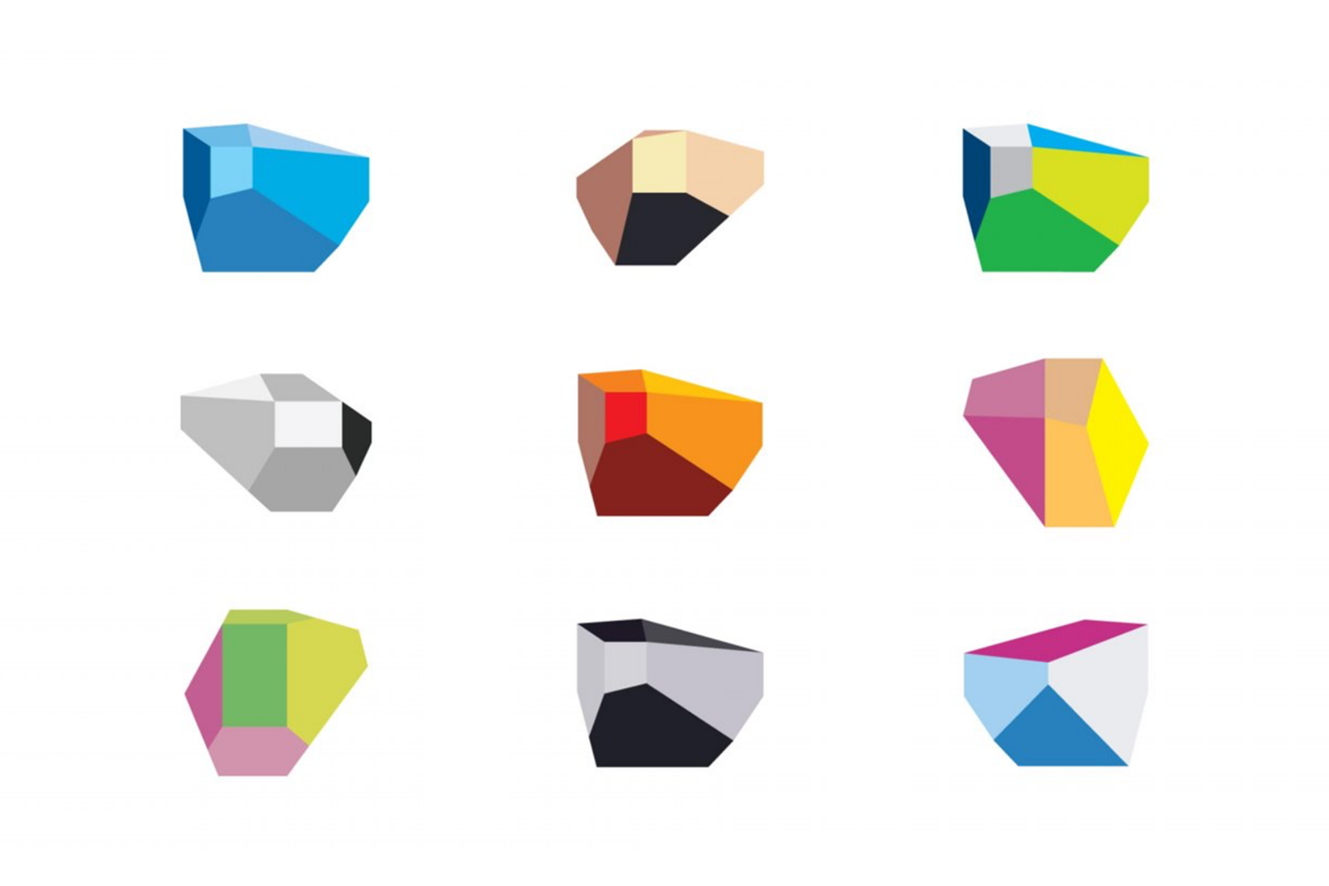 These are considered the new-age logos, and unlike other conventional types of logos, it adapts itself well to the context where it is used.
Thus, rather than having a standard text and font combination in the logo, you can change the logos’ elements on different branding materials.
You can play with creativity and modify the logo to create a slew of impressions on the audience by fitting any scenario. Dynamic logos are used to keep things interesting, and most probably, the audience will be on the edge of the seats to look for creativity.
7. Wordmark Logo
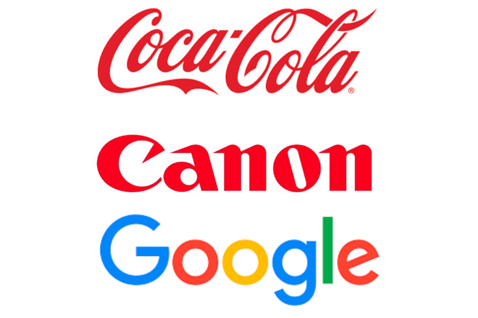 The fundamental difference between a wordmark and a letter mark is that it is a font-based logo that primarily focuses only on the business’s name. Think about the logos of Coca-Cola and notice the creativity. When the company has a distinct and succinct name, wordmarks are a perfect choice.
The title should be catchy and memorable that will be combined with creative typography to create an ever-lasting impression in potential customers’ minds.
8. Abstract Logo Marks
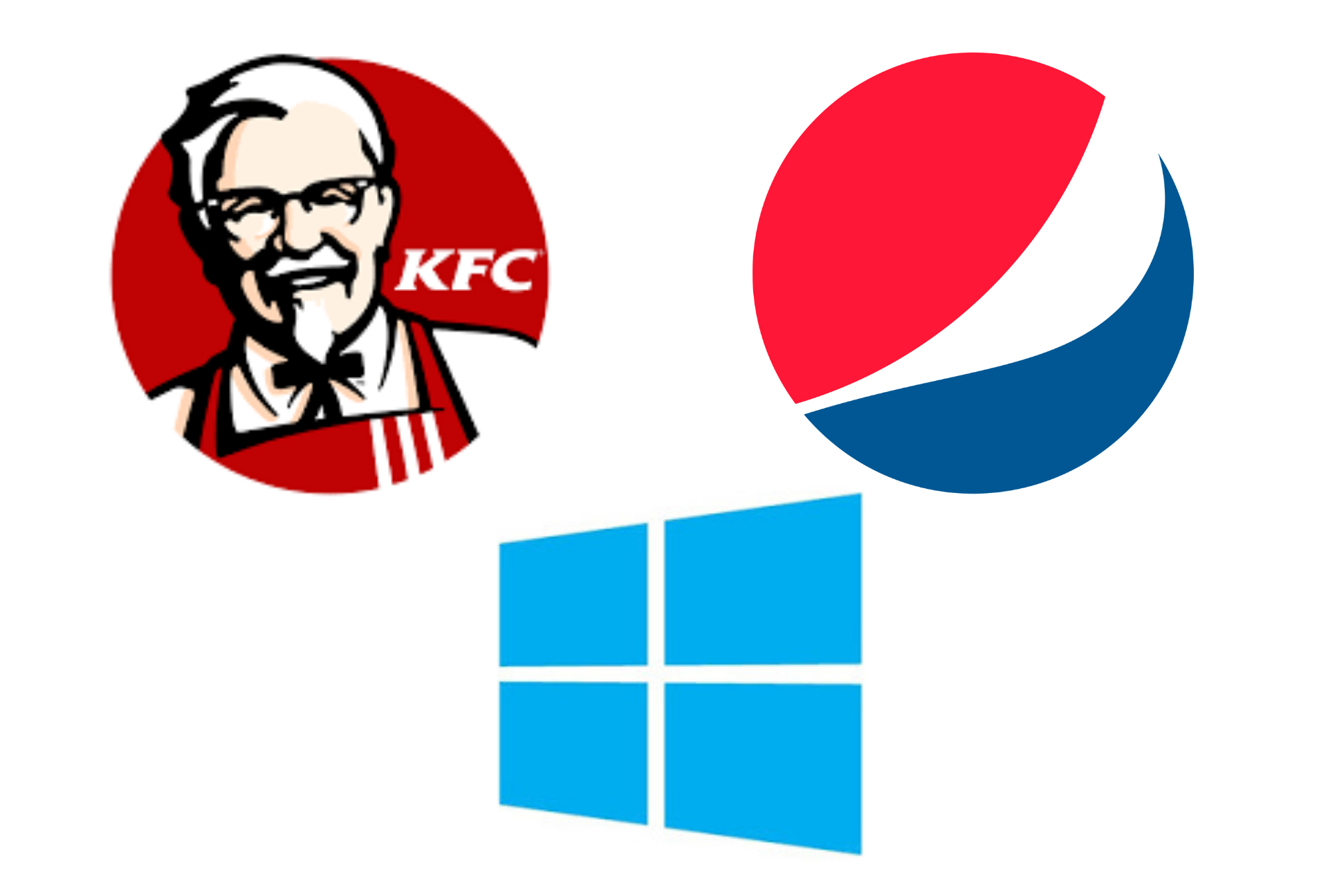 An abstract logo mark is actually a specific type of pictorial logo that uses an abstract geometric form instead of a recognizable image to represent the business. Abstract logo marks work really well because they ideally condense the brand into a single captivating image.
However, instead of being restricted to a recognizable picture, abstract logos can create something truly amazing and unique. The primary benefit of using an abstract logo is that you can convey the company’s offering symbolically without depending upon the cultural implications.
9. Combination Marks
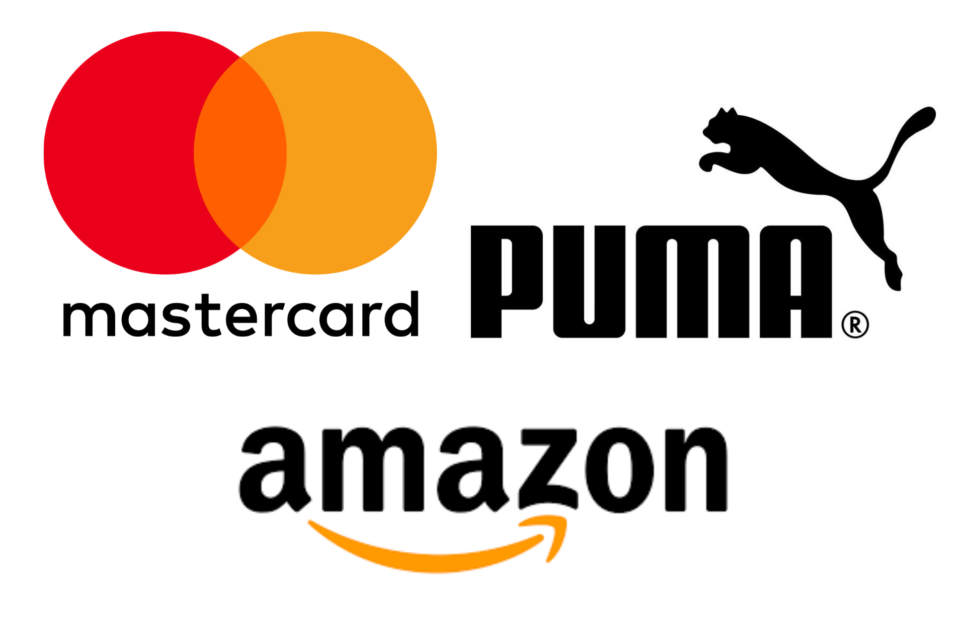 As the name depicts a combined lettermark or wordmark and a pictorial mark, mascot, or abstract mark. The text and pictures can be used side-by-side, integrated, or piled on top of each other to create an attractive image.
Because the name is associated with the image, the combination marks open up versatile choice ways, with both icons and text working together to reinforce the brand.
Some Beneficial Tips: 5 Steps to Hire a Logo Designer on Upwork
People will be able to easily associate the name with the mascot or pictorial mark right away.
Wrapping Up
Regardless of the type of business or the industry you are operating in, it is crucial to pay special heed to the type of logo that will correctly translate your values and offerings to the audience.
Sometimes a simple wordmark will do the job for you that a combination mark or mascot won’t do.
Also, think about the logo’s scalability if you need to use the same logo to run advertising campaigns across different channels.


