Do you ever wonder about how to make a logo memorable? Continue to read further!
A logo is the most influential visual art a brand can express to its clients. Each logo put across an important message. It is essential to make sure that your logo stands out from the crowd.
A memorable logo is distinctive, appealing, and sensible. McDonald’s has the famous logo recognized by the majority of the world. The dazzling golden arches of McDonald’s are simple, yet etched in your mind.
Do you want to create a memorable logo?
Try these five simple tips:
Quick Jumps
1. Unique

Uniqueness contributes a fundamental role in the creation of a memorable logo. A unique logo sells the most in the current market. Analytical research is the surest way to build a rarity in a logo.
Make sure to complete the market research to steer clear of any conflict. Don’t forget to study the new trends to amplify productivity. Market research will bestow a clear indication of the current demands of the industry.
Exploring the current demand of the market will help you discover the lack of elements missed by heaps of businesses. Feel free to adapt to these missing elements in your logo to formulate uniqueness.
It is an excellent thought to shun:
- Readymade logo templates:
Many logo designers endeavor to utilize readymade templates. Evading these premade logo templates is a considerable idea. Such templates show a deficiency of originality and exclusivity of a business.
- Imitation of logo design:
To grab the attention of the viewers, try not to replicate logos from other brands. Imitation of logos reveals a negative influence on your audience. The customers might not consider such brands as honorable and trustworthy.
For instance, the Korean Air emulated the logo from the legendary brand Pepsi. The color scheme and the basic structure of the logo are precisely identical to each other. Such logos can put the reputation of a brand under risk.
2. Simple

Simplicity is an essential part of making a logo memorable. A simple logo is easy to recognize. There is an enormous amount of worth behind the visual appearance of a logo. However, logos don’t have to be ornamental.
Be sure to stay away from the convoluted ideas. Simplicity attracts a decent number of customers. The goal is to get recognition without getting mocked. For instance, the logo for Nike is practical and straightforward.
Remember, simple logos are better.

The graphic designer for Nike merely concluded the logo with a name and a mark. Famous companies like Apple and Google also follow the stratagems of simplicity.
Remember to use the following approaches when aiming for a memorable logo:
- Avoid using multiple special effects.
- Use less than five words.
- Excuse yourself from clip arts.
3. Color Psychology

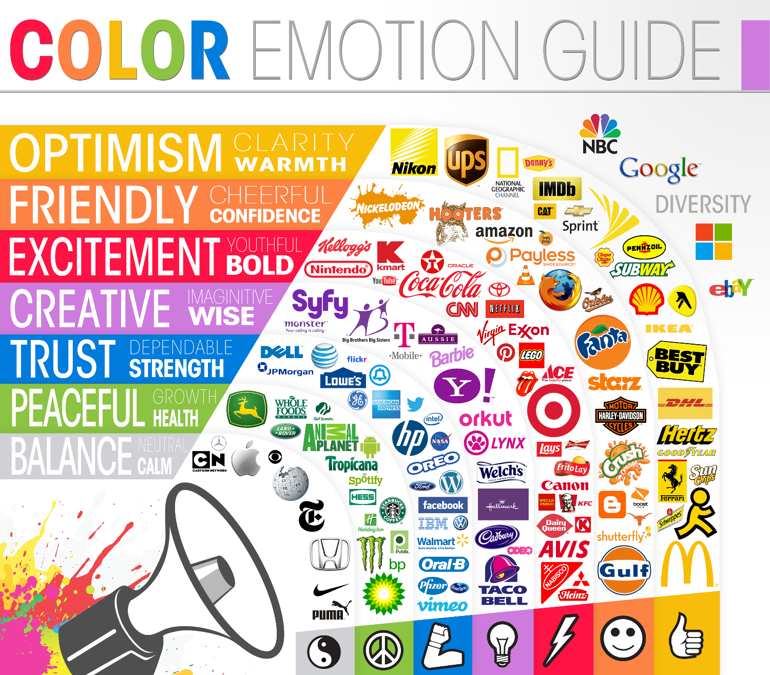
To form a logo, a graphic designer assimilates an assortment of elements to create a stunning success. Color is one of those elements that communicate accomplishment to a logo. An individual’s mind is intrinsically impulsive to act in response to the colors.
Colors can have enormous consequences on our moods. They are exceedingly dominant to the point that they can manipulate perspectives, emotions, reactions, and much more. It is vital to use accurate color schemes in a logo astutely.

Try to be familiar with the psychology behind the colors. Understanding the psychology of the colors can perform as a precious asset for the businesses and the logo designers. Each color expresses an explicit message to the viewers.
Pay special attention to the following strategies:
- Use no more than three colors. The minimum, the better.
- Incorporate trendy colors in your logo design.
Bold colors can depict the attention of the visitors into your business. Don’t go over the board with bright colors. They can certainly overwhelm you. Remember to select the colors that will help your logo to be distinctive and remembered.
An understanding of the tone for each color is essential before incorporating it into a logo design. Following are examples of few colors along with its described tones:
- Yellow: creativity, warmth, and happiness.
- Blue: Trust, peace, and loyalty.
- White: clean, simplicity, and honesty.
4. Typography

Typography is visual art that aligns content as a readable, clear, and appealing text to the viewers. It comprises typefaces, styles, and arrangements of the text or letters.
Consider the following points when creating a memorable logo:
- The spaces between text and the letters
- Descended and ascended alignment of the letters
- Height of the cap
- Stokes
The selected type of classification in a logo clutches a heavyweight. It is a great practice to combine serif and non-serif type classifications in the typography of a logo. Discover the available variations within these fonts.
A typeface can either create or smash a successful logo design. Make sure to explore all the fonts before integrating them into a logo design.
5. Black and White

The monochrome logo is one of the oldest and popular styles in the logo industry. Many businesses and graphics utilize black and white color since it saves heaps of ink for printing.
Famous brands such as Gucci, Puma, Chanel, Sony, and Adidas utilize monochrome style logos in their businesses. These logos incline to be classy, elegant, and unforgettable.
The key focus of a monochrome logo is on its style and icon. Make sure to choose the right logo design style and the accurate icon for such logos.
Conclusion
The current graphical industry is moving swiftly towards innovation. Each business is seeking to formulate a logo that is not only eye-catching but also memorable. A memorable logo requires specific attributes.
Make sure your logo is unique and knowledgeable. An unseen logo always grasps the interest of the consumers nowadays. The rarity of a logo will differentiate your brand from your competitors.
Remember, color and typography is the key to a memorable logo. The selection of the right typeface will make your brand to be noticeable. Select the color that reflects upon the considerable tone of your business.


![How to Make a Logo Memorable? [5 Crucial Elements]](https://santagraphics.com/wp-content/uploads/2020/07/5-Crucial-Elements-Of-Creating-A-Memorable-Logo-Design.jpg)