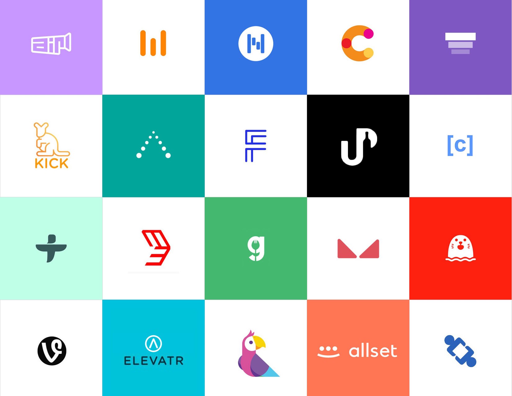
The logo isn’t merely a symbol of the company, but it says a lot about the mission and values of the business. It helps marketers to translate the purpose of the existence of a business to create a connection with the customers.
A well-crafted and ingenious logo design can be the game-changer for you that’s why effective logo designs are expensive.
Aren’t you getting the desired results from your marketing campaigns? One of the reasons can be your logo. You should know the 10 principles of an effective logo design to make it an unforced and natural choice for the audience.
Quick Jumps
1. Unique and Original

The logo should be unique enough to attract the attention of the people. When uniqueness blends with originality, you will get a distinctive logo to build your brand identity. The best way is to think of all the ineffable logos stashed in your memory and try to meet their level. The logo must attract the first glance out of a crowd that people will build a sense of trust and reliability after recurrent interactions.
A skilled graphic designer can understand all your requirements to create a truly unique and original logo. The logo of your brand shouldn’t look even a bit like any of your competitors.
2. Simple yet Compelling

One of the essential qualities and requirements of excellent logo design is that it should be based on a simple concept. A logo should give a clear and immediate sense of “you” to the viewer. The audience should understand the business message from each element and the logo as a whole. Try to avoid complexity and get rid of the elements which do not contribute to the logo. In a nutshell, less is more, and simple design doesn’t need any explanations.
3. Well-chosen Color Scheme

To make your logo design more appealing, you should choose the colors strategically and cleverly. Colors can evoke the feelings of the audience as red is considered to be a more aggressive, energetic, and passionate color. Thus, if the business is dealing with something that is for the young generation, hues of red can work like magic.
Avoid using too many bright colors that will make your logo like a rainbow at the end. It is wise to choose one or two colors and play with them to come up with something compelling.
4. Scalability and Versatility

Don’t forget the fact that logos are to be used on different platforms in a variety of ways and formats. It would be used on shop signage, digital ads, billboards, stamps, brochures, pens, etc. If the details of the design are not visible when printed on small surfaces and lose the sense of proportion on larger surfaces, then you should consider redesigning it.
Remove any unnecessary elements and use fewer lines and colors. Using design grids to make it scalable and versatile can help you a lot in maintaining the balance between elements.
5. Modern Yet Timeless
 As trends are changing, so does the taste and aesthetic sense of the customers. In the efforts of making a logo modern, you should not make it complex enough that the design will expire after a year or two. A timeless logo will look just as captivating in five years as it looks today. A classic logo like that of psychedelic 70s-inspired one can be all the rage in today’s industry but can fade away in a year or two.
An epic logo should stand firm in the test of time because it is designed by experts who pay attention to the rules and principles rather than following what others are doing.
6. Proportional and Well-balanced

Balanced and proportional designs are recognized as beautiful by humans as they strike a perfect blend of different elements and colors. Proportion refers to the size and weight of each element to make it whole.
You might already know that symmetrical logos are balanced by using equally weighted elements which are aligned on either side of the central line. Unsymmetrical logos can be balanced by using an uneven composition that has equilibrium.
7. Original Typography

It is crucial to use original typography and avoid using common formats. The recognition will make it drab and uninteresting if everyone is using the same fonts and style. How do you see a logo with a Calibri font and think, “that’s captivating?” No?
A beautiful, distinctive, and custom-made typeface will help in making your logo design unique and original. Don’t compromise on the readability in the pursuit of “uniqueness.”
8. Monotone
 Distinguishing between a variety of colors can be difficult in a small-sized format. Thus, it is important to limit the color scheme and can be ideal to use black and white colors. Start with sketching out the initial concept in black and white to know how it will look in the purest form. The overall design idea can be disrupted by adding more colors in the initial stages.
9. Brand Heritage

To respect the brand heritage, the logo should exactly translate your success and make it more straightforward. Don’t forget the subtle nuances and history of the brand while making it simpler.
The main concern of having a logo is to showcase the brand heritage to the people. Must read the research conducted by Atsushi Kimura,Yuji Wada on Memory Color Effect Induced by Familiarity of Brand Logos.
10. Memorable
The most striking quality of the logos of multinational and global companies is that they are memorable. People should be able to build a connection with it in their minds, and a logo should remain in their memories for a longer time. Otherwise, it may not be able to win the loyalty of the customers. You should have a unique concept design that isn’t used by anyone else before.
Wrapping Up
In this global market, it is becoming challenging to pace with the continually changing taste of the customers. You need to put backbreaking effort and spend a lot of time and resources to stand out from a plethora of competitors to reach out to the target audience. The artistry should meet great ideas combined with an extensive understanding of consumer design. Thus, you should comply with these principles to create an effective logo design.


